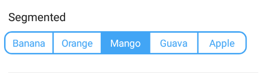
Segmented
The Segmented form element is used for a radio group.
NOTICE
The ListItem class is provided in the example app. Your custom class just needs to override toString() to display in the segmented group.
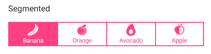
SegmentedDrawable
The SegmentedDrawable interface must be implemented by your custom class to provide the drawableRes.
- Example: fruitsSegmented[0].drawableRes = R.drawable.icons8_banana
Horizontal
By default this is true. Setting this to false will stack the radio buttons vertically.
segmented<ListItem>(1) {
    horizontal = false
}
Fill Space
By default this is false. Setting this to true will fill the whole width.
segmented<ListItem>(1) {
    fillSpace = true
}
Drawable Direction
By default this is DrawableDirection.Top. Setting this will change where the drawable is displayed relative to the text.
Center
DrawableDirection.Center will center the drawable. This also removes the text.
segmented<ListItem>(1) {
    drawableDirection = FormSegmentedElement.DrawableDirection.Top
}
Tint Color
By default this is the value of R.color.colorFormMasterElementRadioSelected. Setting this will set the tint color for each radio button.
segmented<ListItem>(1) {
    tintColor = Color.BLUE
}
Margin (Stroke)
By default this is the value of R.dimen.elementRadioStrokeBorder. Setting this will set the margin (stroke) for each radio button.
segmented<ListItem>(1) {
    marginDp = 5
}
Unchecked Tint Color
By default this is the value of R.color.colorFormMasterElementRadioUnSelected. Setting this will set the unchecked tint color for each radio button.
segmented<ListItem>(1) {
    unCheckedTintColor = Color.WHITE
}
Checked Text Color
By default this is the value of R.color.colorFormMasterElementRadioSelected. Setting this will set the checked text color for each radio button.
segmented<ListItem>(1) {
    checkedTextColor = Color.WHITE
}
Corner Radius
By default this is the value of R.dimen.elementRadioCornerRadius. Setting this will set the corner radius for each radio button.
segmented<ListItem>(1) {
    cornerRadius = 5f
}
Text Size
By default this is the value of R.dimen.elementTextValueSize. Setting this will set the text size (In SP) for each radio button.
segmented<ListItem>(1) {
    textSize = 12f
}
Radio Button Padding
By default this is the value of R.dimen.elementRadioPadding. Setting this will set the padding for each radio button.
segmented<ListItem>(1) {
    radioButtonPadding = 5
}
Radio Group Wrap Content
By default this is false. Enable to set the radio group layout_width to "wrap_content"
segmented<ListItem>(1) {
    radioGroupWrapContent = true
}
Width of each radio button
By default, this is null which does not set the width.
segmented<ListItem>(1) {
    radioButtonWidth = 180
}
Height of each radio button
By default, this is null which does not set the height.
segmented<ListItem>(1) {
    radioButtonHeight = 240
}
Example
Kotlin
segmented<ListItem>(1) {
    options = listOf(ListItem(id = 1, name = "Banana"),
                     ListItem(id = 2, name = "Orange"))
    value = ListItem(id = 1, name = "Banana")
}
Java
List<BaseFormElement<?>> elements = new ArrayList<>();
FormSegmentedElement<ListItem> segmented = new FormSegmentedElement<>(1);
segmented.setOptions(Arrays.asList(new ListItem(1L, "Banana"),
    new ListItem(2L, "Orange")));
segmented.setValue(new ListItem(1L, "Banana"));
elements.add(segmented);