DropDown
The DropDown form element is used for a single choice dialog.

NOTICE
The ListItem, ContactItem, and ContactAutoCompleteAdapter classes are provided in the example app.
Theme
Set this to override the default alert dialog theme.
dropDown<ListItem>(1) {
    theme = R.style.CustomDialogPicker
}
Display Value For
This can be used to set the text that is displayed in the options and field. Your custom class can also just override toString() to display in the dialog.
dropDown<ListItem>(1) {
    displayValueFor = {
        it?.name
    }
}
Array Adapter
Set your custom AutoComplete adapter. It is up to you if you want to retrieve items through an API call.
dropDown<ContactItem>(1) {
    arrayAdapter = ContactAutoCompleteAdapter(this@FormActivity,
                        android.R.layout.simple_list_item_1)
}
Display Radio Buttons
By default this is false. Enable to display the radio buttons
dropDown<ListItem>(1) {
    displayRadioButtons = true
}
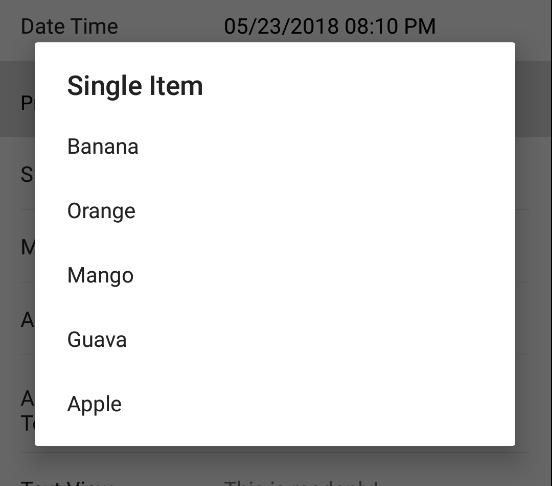
Dialog Title
By default this is "Select One". Setting this will override the alert dialog title.
dropDown<ListItem>(1) {
    dialogTitle = "Select One"
}
Dialog Empty Message
By default this is "Empty". Setting this will override the alert dialog message when the options list is empty or null.
dropDown<ListItem>(1) {
    dialogEmptyMessage = "Nothing to see here"
}
Example
Kotlin
dropDown<ListItem>(1) {
    dialogTitle = "Select One"
    options = listOf(ListItem(id = 1, name = "Banana"),
                     ListItem(id = 2, name = "Orange"))
    value = ListItem(id = 1, name = "Banana")
}
Java
FormPickerDropDownElement<ListItem> dropDown = new FormPickerDropDownElement<>(1);
dropDown.setDialogTitle("Select One");
dropDown.setOptions(Arrays.asList(new ListItem(1L, "Banana"),
    new ListItem(2L, "Orange")));
dropDown.setValue(new ListItem(1L, "Banana"));
elements.add(dropDown);